For two years, between 2010 and 2012, the covers for Deutsche Grammophon’s highly respected Collectors Edition series were designed by Aileen Reese, who was still a student at the time. The series presents repertoire anthologies in authoritative recordings from the label’s rich catalogue, with each multi-CD set housed in a capbox.
The Collectors Edition design is updated at regular intervals, and a relaunch was due in 2010. In the summer of 2009, therefore, DG’s art department contacted Design Factory, a private college in Hamburg that specialises in communication design. As part of their vocational training, and within the context of a competition run by the college, students in their second semester were asked to develop a new design that could work across the series as a whole. Aileen Reese came up with the winning concept. Her prize for impressing the jury was to be allowed to design a total of 39 titles over the course of two years, 21 of which were for DG’s sister label DECCA.
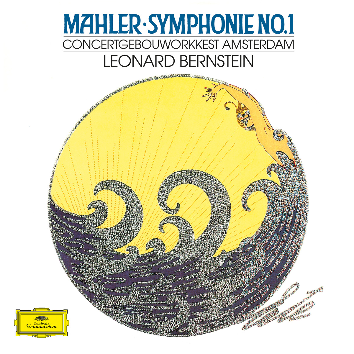
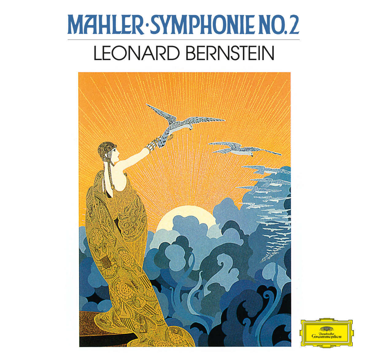
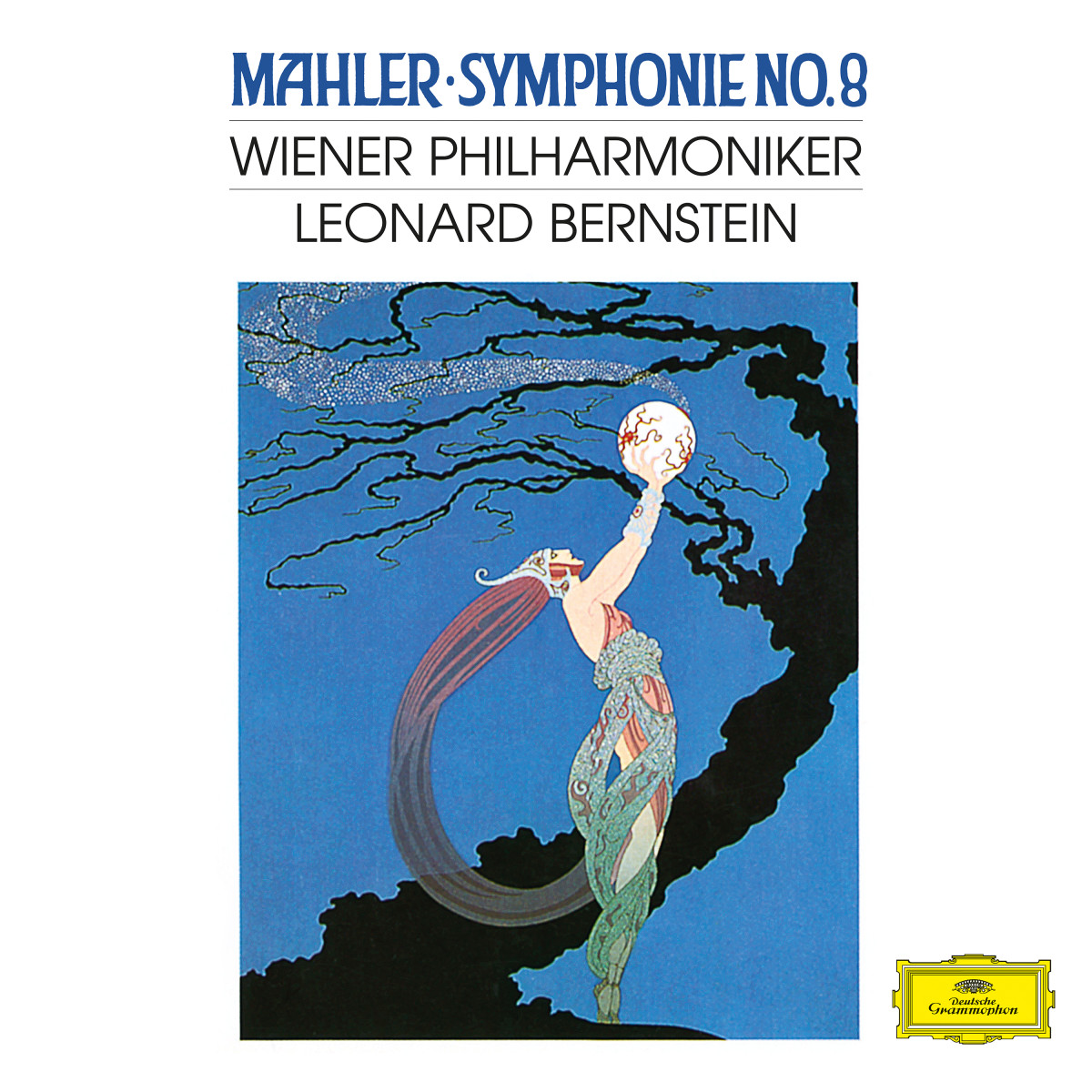
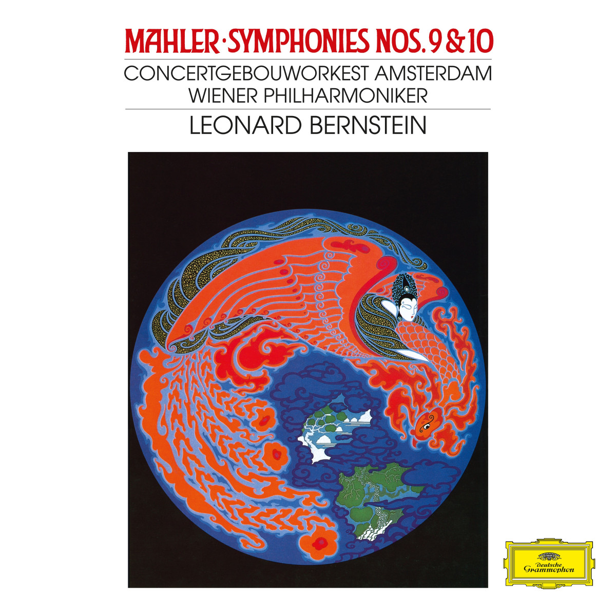
Reese's idea was to present each capbox as a letter, parcel or package, with the various standard visual elements of postal consignments used to convey the essential information for the album in question. The “stamp” featured the name and a portrait of the composer, while the information about its monetary value was replaced with the number of CDs in the box. There was also a “label” with either the traditional yellow DG cartouche or the Archiv Produktion logo. Where you’d expect to find the name and address of the recipient, the composer’s name was repeated, followed by the repertoire and performer details, often in a handwritten-style font. The one identical feature of every cover was the circular COLLECTORS EDITION “postmark”. A distinctive set of covers was thus created, with details that could be varied for each release while at the same time visually unifying Collectors Edition as a series.
Incidentally, a brand-new vinyl edition of these recordings was released in 2022, with a very different look: